Friday, October 4, 2013

carlsbad artsplash

THE CHALK SQUARE


as usual i didn't do the traditional . . . but i had lots of fun with the public. this years theme was the 'wheel deal' and we already covered the story about the silent auction . . . so my square was a series of my animals on wheels !!!

it was my birthday weekend.  we ended up coming down early friday because bo had to work.  i tried to work on my square once i found it . . . but was promptly bitten by ants.  ron juncal gave me some baking soda mixture for around the square and it helped for saturday !!

i came knowing i was going to create the front 2 characters . . . the unicycling umbrella bird pulling the unicorn toy. they can be found in the letter u illustration from the ALPHABET KINGDOM book.  and of course i had to add a pelican for the sponsor !!

i developed my characters relaxing at bo's work with an appetizer.  basically finished on saturday but added contrast and darker blacks the next day, sunday. oh and on my birthday (saturday) i was given flowers from the recycle garden at the event !!!


self promotion at the square !!


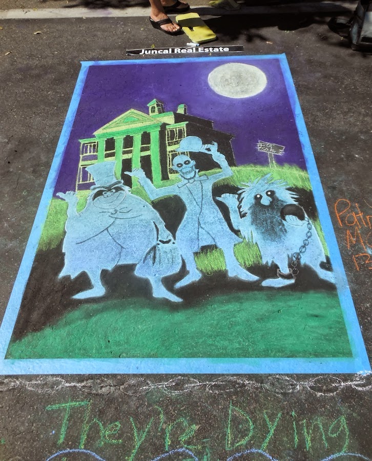
patrick's square . . . my neighbor last year and this year . . . 


last year these guys stepped up and did a square where the artist didn't show up .. . 
they did a take on 'x y z'  from  ALPHABET KINGDOM.
this year they stepped in and helped again . .  . 
love the yellow submarine !!! one year it was my daughters halloween costume.


double the fun !!!

'ELEPHANTs ARE MY FAVORITE'  jax


while working on his skateboard i ended up not doing the full monster theme . . . i was in the mood for primates and he let me . . . . so i had some paper ready to paint and drew out an elephant !!  once again i was having fun with glazes and it was totally imagination time.  i had to add some lighter contrast (because i started on red) so i drew with white paint.  as i progressed i liked the playful feel of colors . . .  jax agreed.

the background is loaded with oranges, yellows and reds. . . . 

the ballpoint + skateboards

'CLYDE'

so i have this skateboard to do for a silent auction at this year's carlsbad artsplash.  i thought of making it different by using my ballpoint pen.  decided it would be a good idea to play around with a wood pane before working on the skateboard.  i ended up  with 'clyde' . . . and totally loving the effects of wood.


THE NEXT STEP . . . .  the skateboard,  'pugmarks'


started the same way . . . but added titanium white
before adding acrylic glazes . . . this creates a stained look.  and yes ! the drips were the usual spray bottle.  so after staining  i redid some of the ink and i rubbed off the glaze or scratched with an etching tool for the whiter whites.

the board was/is called pugmarks because that is
what tiger paw prints are called.  i added grip tape over the pugmarks that were first drawn with my pen . . . this was to mesh skateboarding and art a little more . . . . and it can be used if they wish !


'THE GANG' . . .  skateboard #2


continuing my play on wood . . . skateboards !!  the grandson's board . . . we did his monkeys (primates) and then for the monster effect a gorilla skull design with horns . . .  on the front kept a simple graphic with clear grip tape on top.
this board will be used and i also liked the yellow stain that was
already on the board.
jax was involved with the design every
step of the way.


charcoal + acrylic glazing

MR. DANGER


so i continued on with the technique of 'stuck' but this time i added color glazes . . . the youngest grandson, mr. danger.

i started with charcoal . . . erasers . . . adding . . . . subtracting . . . and then . . 

the best complement is dangers mom can't get over his look . . . 'i see that everyday' . . . 

drawn detail


the stages


Tuesday, October 1, 2013

mo' ... sketchbook series

' . . . AND WHAT ? '    


so this was the first of the sketchbook series attempted
 on canvas board and as i progressed i decided to leave it black and white.  as others saw it they all agreed.  this one i did have to frame because there is just no other way to hang.


the comeback

THE MINIs


this guy currently represents me !


so with weakness left in my arm from the pinch nerve i spent two weeks just doing nothing but non-stop sketching ... i started to do sketches on ATC and in doing so made fun little works of original art.  i like working really small or really big . . two extremes.  and it has also allowed me time with my illustration style
which i love !!

created some fun little guys and recreated some fun characters from my book alphabet kingdom !!

well turns out  i am addicted to these little guys . . .


it's been a while !!

WHERE TO BEGIN ?


had started the spring with a pinch nerve in the back that killed my creativity . . . productiveness . . . .  but did still managed to get a few things done.  did one chalk fest in downey where we worked on paper which ended up being my worse piece ever!!  and in public not good for one's ego especially a professional but at the same time i often have scribble scratch but in time it's the final product that makes me who i am. one step toward the next.

i did finally start and finish my second piece of the behind the glass series . . . polar plunge.  that alone took 3 months and tons if not thousands of glazed layers.  as i photographed my journey some of the early stages look great . . . . but it was the actual look of the canvas that drove me to it's final stage. 


1st round of stages

so in the beginning lots of movement and development of the rock mass that was in view . . .  and a second polar bear.  the paint was way too thin on the canvas and the washes of movement were separate strokes not the large mass of water that i wanted.  i wanted to come specific elements to come a live : cold water . . the glass . . . under and above water.  in the last frame above things started to smooth out with the water.

second round of stages

things were coming along but the water lapping against the window was a little too wavy . . . wanted it more subtle for this series (at one point i poured alcohol on the waves and scraped off the paint). the second picture i added white to make sure the areas i liked didn't get darker because there were more layers of blues and . . . to come.  the next to last starting to get rid of that milkiness left from the whites. (i say whites because sometimes i add other colors to alter the titanium white).  the last in the second round of pics is getting there.  in the end even though the bottom is dark you still get the sense of a mass being there on the left . . . the feel of the rock though unseen still exists.


hanging in the gallery